The Challenge
Between their clinical and retail audiences, Biofreeze struggled with distinguishing their digital branding. Our goal with their digital presence was to create clean consistent designs across all platforms while satisfying multiple audiences
My Role
UI/UX Designer ~ Create unity between designs and navigable connected experiences. Make informed design decisions based solely on thorough analysis of the platforms and users that interact with
Deliverables
Optimize Website, Emails, Professional Finder, and Social Media Presence, in time for the retail launch of Biofreeze and the Drew Brees campaign
Prototyping/Biofreeze.com
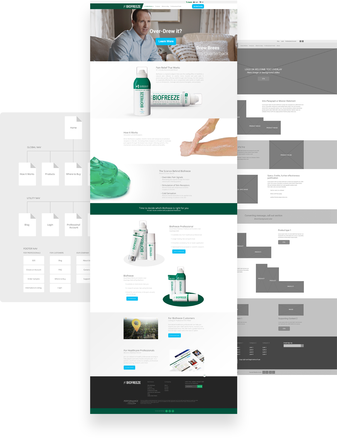
By taking a deep dive into the analytics of the pre-existing sitemap, provided me a route in which I could transform and improve the user journey. The navigation was originally complex and hid components users often searched for
Device Responsive
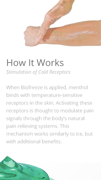
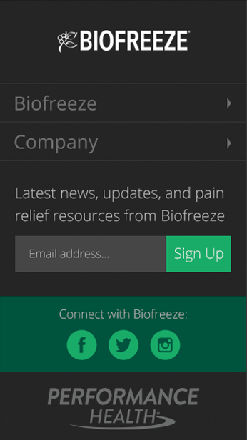
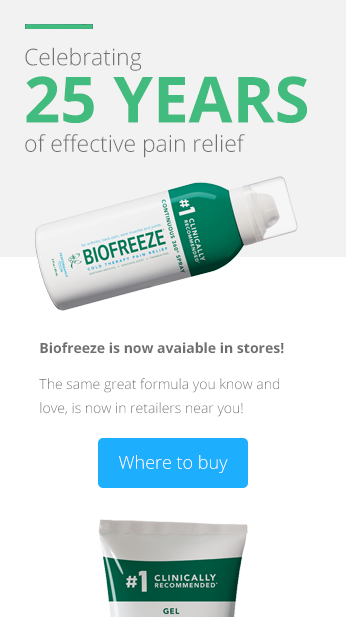
Created a functional experience, and scalable design. Design that can intelligently adapt to varying screen aspect ratios, that relies more on pure HTML5 and CSS3 as opposed to heavy scripts and imagery
Professional Finder Account
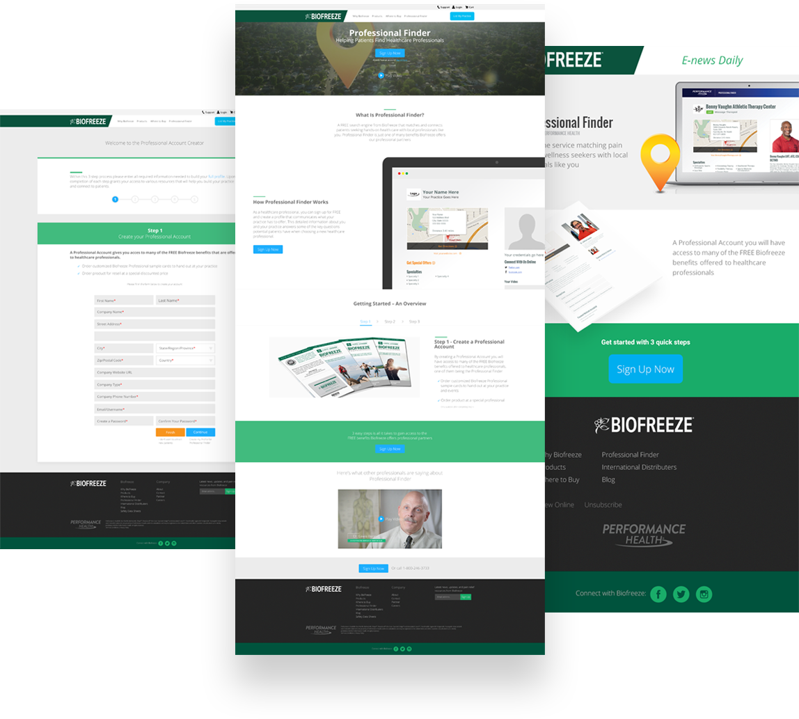
A platform created to acquire Biofreeze healthcare professional partners, and connect them with patients. The previous complex system and the 10+ steps it took to complete, had a negative impact on the number of users signing up. As the project strategist and UX lead, we set out to improve the experience through design sprints and data monitoring
The Solution
By strategically simplifying the entry landing page into the sign-up process, and consolidating the steps that followed, we were able to substantially increase engagement and goal completions. Creating a mobile-first solution given the preferred device used by the audience, we found resonated well and became the lead funnel to partnership growth
Where To Buy
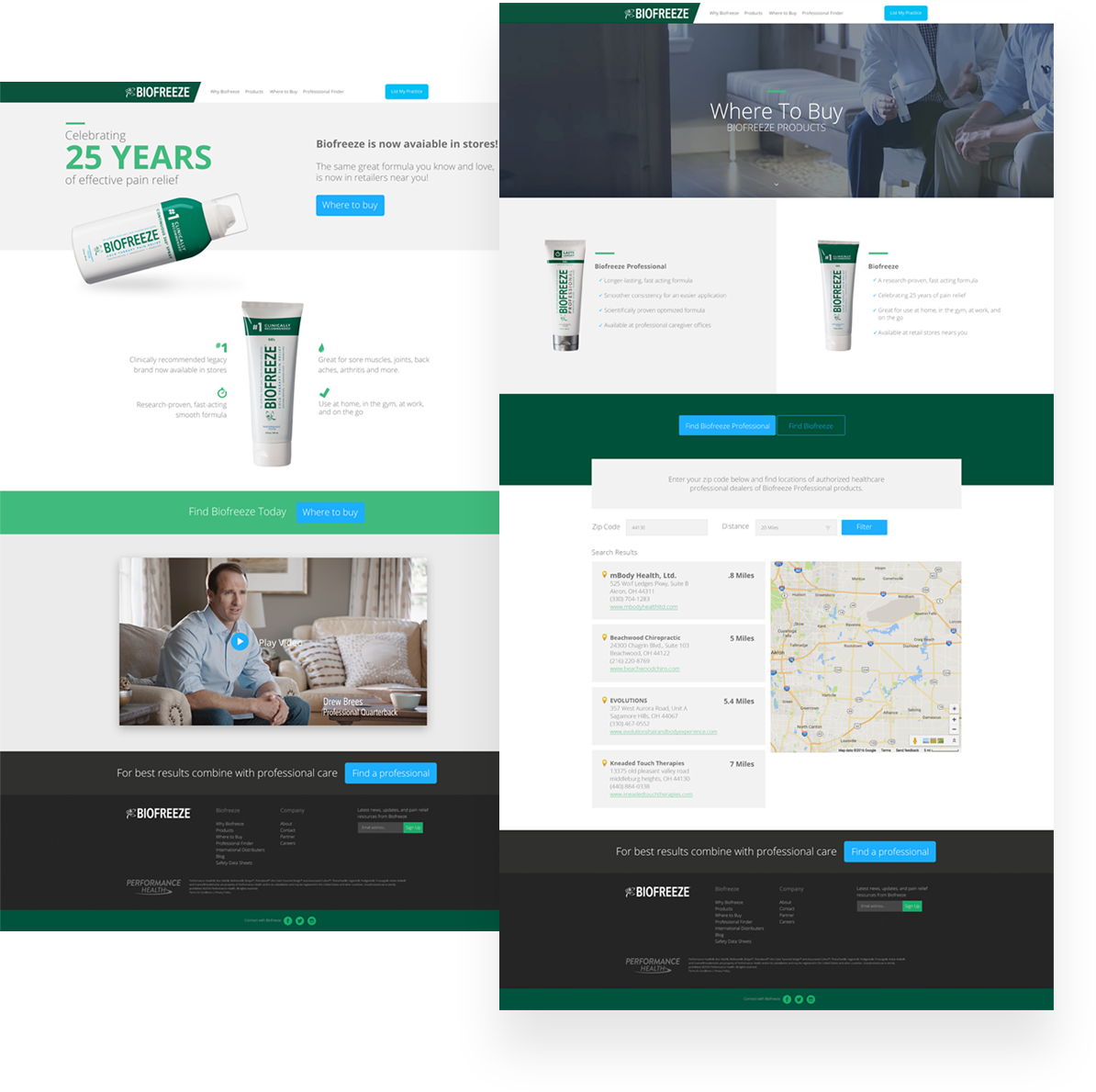
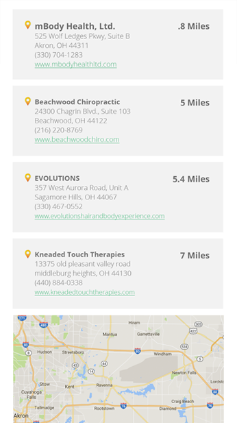
The Biofreeze online presence suffered from not having a clear destination of official Biofreeze distributors, and how to find them. We knew we had to do a better job at connecting users to products, and creating leads
The Solution
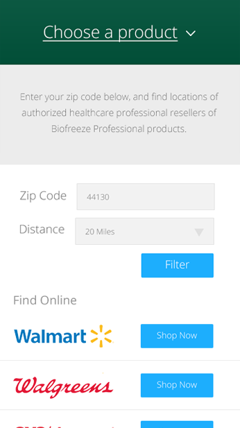
Originally tasked with making 3 separate experiences for finding the various types of Biofreeze, I came up with a simpler solution. Create a single engine that would allow users to make the correct choice for the product that fits their needs, in one location
Biofreeze Blog
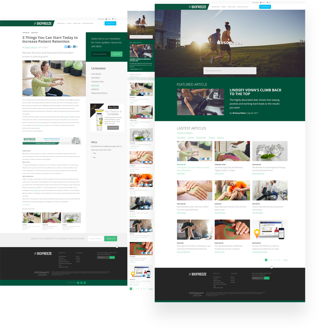
The Biofreeze blog was originally just essentially an area for additional information pages, further explaining the capabilities of Biofreeze. Tackling the redesign, we knew we wanted to push the experience further than just articles and information
The Solution
Creating a hub index, allowed users to navigate and see the latest content posted along with personalizing their experience. Fully responsive dynamic structure, that leveraged SEO tactics ensuring target users were viewing content of related interest
